 Use District Explorer Like a Pro
The Colorado Political District Explorer puts registration trends and competitiveness at your fingertips. This new interactive web application provides historic registration trends, current demographics, and future competitiveness. Information is available for every County, Congressional, State Senate, and State House District in Colorado. The below covers how to interpret the data presented by this tool and the various functions within it.
The Basics
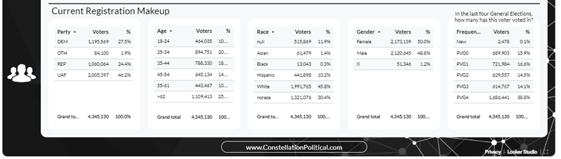
The bottom four tables showing “Current Registration Makeup” as seen in Screenshot 2 are pretty straightforward. These tables show how the current registration for the selected district breakdown. These values are updated each month when the latest figures are released. That means that the data shown here will be the data as of the first of the month in which you’re viewing the tables.
Each table shows the raw count of registered voters for each category as well as the percentage of the district that each category contributes toward the total registration of that district. The tables showing “Party”, “Age Range”, and “Gender” all show data captured by the Secretary of State at the time of registration so these values can be counted on to be precise.
The table showing “Race” relies on estimates. Race is estimated using the same methodology that the U.S. Census uses when estimating. The Census maintains a list of last names and how prevalent they are among different racial groups. In the case of any last name where 80% or more of the bearers are of a particular race, we assign that race to the voter.
Frequency is a measure of how likely a voter is to cast a ballot in the upcoming election. This table shows voter counts by how often they return their ballot. Frequency is calculated based on how many elections out of the last four General Elections a voter has cast their ballot. Voters who have registered since the last General Election are shown in the “New” row. For example, as of this writing, we can see that in Colorado 38.8% of all voters cast a ballot in all four of the preceding four General Elections — 2022, 2020, 2018, and 2016. When combined with cross-filtering, this can provide a sense of how likely different groups of voters are to turn out.
Cross-filtering
The tables across the bottom also allow for “cross-filtering.” For example, say you wanted to know the partisan composition of Females in Colorado. If you click the “Female” row within the “Gender” table, all of the other tables will be narrowed to only show information about voters in the selected category. If we make this selection and then look at the party table we can see that (as of this writing) in Colorado 27.5% of all voters are registered Democrat, but that 32.1% of all Females are registered Democrat.
You can filter by any different combination of tables that you like by simply selecting a row from each table.
Historical Data
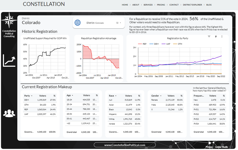
The top row of graphs shows how the district is changing over time.
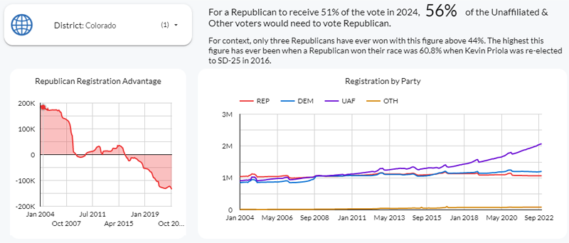
The right-most graph shows the raw numbers for party registration for each month that data is available. This view is an easy way to get a sense of how a district is evolving over time. The middle graph further distills this information by showing the Republican registration advantage over time. This is simply the number of registered Republicans minus the number of registered Democrats in each month. Obviously, higher numbers are better.
Competitiveness & Comparison
The most important graph on this dashboard is the left graph on the top row. This further distills the historic data to a single-point value. This graph shows the percentage of Unaffiliated & Other voters that would need to vote for the Republican candidate in order for that candidate to receive 51% of the vote in the next upcoming election. This measure is the only valid way to assess the competitiveness of a district. And I have covered this in great detail in two additional posts:
The SD 20 Fallacy
How Republicans Will Lose 2020 Reapportionment
This measure is so valuable because it allows one to make like-for-like comparisons about competitiveness to different years and districts.
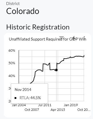
By way of example, consider the graph of this measure for Colorado statewide as shown in Screenshot 4.
If you hover over this graph you can see that in November of 2014 a Republican would need 44.5% of the Unaffiliated & Other vote in order to receive 51% of the vote Statewide. This was the year that Cory Gardner won the U.S. Senate race and was also the last year that a Republican won a major statewide race in Colorado. Scroll forward to November 2020 and we can see that this figure climbed to 55.4%. This means that for a Republican to have the same performance in 2020 that they did in 2014 they would need to do 10.9 points better among Unaffiliated & Other voters.
This is also the best measure to use to compare the relative difficulty of two different districts. The top-right of this dashboard shows the latest RTLA figure for the district you’re viewing. Imagine you’re a candidate trying to decide between a run for State House District 27 or State Senate District 20. You could consult these figures to get a firm gauge of the difference in difficulty between running in the two districts.
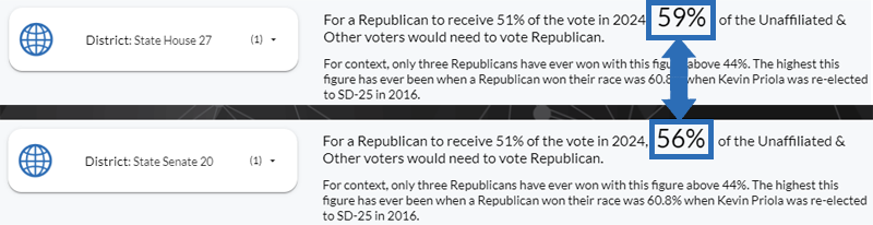
As of this writing, the figure for HD-27 was 59% and the figure for SD-20 was 56%. This means that in the 2024 election, HD-27 will be three points more challenging for a Republican to win than would SD-20. For context, 3-5 points is about as much as an excellent legislative campaign could ever hope to move the needle. This comparison works between districts of any type and cycle.